Today has been a doozy of a day.
I’ve never exaggerated about my age in this blog. I am 53 years-old. And 53 is what it is…middle aged and some
issues are beginning to crop up in the getting-older body. While my mind still thinks it’s a
20-something, my body is sayin’ it ain’t cashing that check.
Today was one of those check-bouncing days. I have horrible eyesight and wear contacts or
glasses every waking hour. Today I had
to go see my optometrist, an energetic 20-something woman whose body isn’t even
writing checks yet. The good news is no
glaucoma, no macular degeneration, and no sign of cataracts.
The bad news is I’m still blind as a bat.
That and my pupils are still dilated to the point you
can’t see hardly any blue at all. If I
had been pulled over by the police at any given time today, I would have
promptly been asked to pee in a cup.
However, my eye doctor was very intrigued about
quilting. When she asked if I wore
reading glasses in addition to my contacts, I mentioned I wore a magnifier when
I appliqued. Which brought up questions
about what that was and what all quilting entails.
Moral of my morning appointment: She said all quilters need to take care of
their eyesight. She was happy with my
explanation of Ott lights and magnifiers and cautioned me (as well as every
other quilter) to be careful with their eyes.
Rest them after about 20-30 minutes of hand sewing. Make sure the lighting is not just adequate,
but really, really good.
Of all the senses we use, as quilters, sight is really
precious.
I hadn’t intended on sharing all of that, but as this
week’s blog is on color, I did think it was pertinent.
I love picking out fabric for my quilts. I love color
and design. And quilters, as artists,
are sensitive to color. There are the
pure colors – which are the primary colors and all the colors that are made by
mixing any two of the primary colors. Tints
are made when white is added to any color in varying amounts. Tints are colors such as apricot, pink,
lavender, mint green, robin egg blue, and light blue. Shades are created when
black is added to a pure color. With the
addition of black, colors such as olive, avocado, rust, brown, cranberry,
maroon, navy, emerald green, teal, dark blue, and dark violet are created.
Tones are made when a pure color, tint, or shade has
been grayed. If the graying is minimal,
the effect is subtle. The color, tint,
or shade is slightly softened. If the
graying is more extreme, the color itself appears gray with just a hint of the
color. Beige, tan, rose, mauve, plum,
heather, dusty teal, bluish gray, and salmon are tones.
All of these colors, tints, shades, and tones are
wonderful and you only have to glance outside of your window to see how Mother
Nature uses these in a grand harmonic gesture.
However, there are two colors that are particularly intriguing to me as
a quilter.
These two colors are lime green (a mix of yellow and
green) and purple (a mix of red and blue).


It heats up immediately.

Next to a warm color, it’s warmer.


When I first started quilting back in 1985, it was a
pretty hard and fast “suggestion” (because there really are no rules in
quilting), that a quilt needed to be a balance of warm and cool colors. The warm colors of course are the reds and
oranges and yellows. The cool colors are
the greens and the blues.
Current quilting has kind of blown that “suggestion” out
of the water. The 2013 and 2015 APQS
winners had yellows and oranges as their background fabrics, fully nullifying
the cool/warm balance rule. While cool
colors were used in these quilts, the overwhelming color scheme was warm.
And you know what?
That’s fine. The quilts are
beautiful.
However, getting back to the lime green and purple, the
reason I like them so much is that they play on both teams.
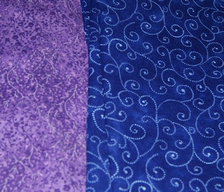
Place purple next to a cool color, such as blue, and it
looks cool.

But watch what happens when
you place it next to a warm color such as red…

The same thing happens to lime green. Next to a cool color, it’s cool.


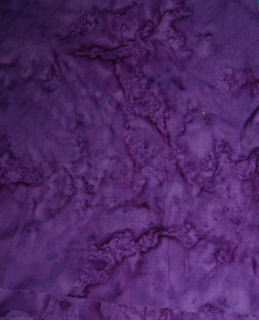
I think it’s even more noticeable in batiks, where the
colors undulate.


Moral of this story – while purples and lime greens are
great to play with and are the most versatile of colors – they do make
placement of them a little tricky.
Please note that if you’re using them as a cool color, make sure they’re
placed next to cool colors. If it’s used
as a warm color, make sure it’s next to warm colors. Otherwise, they’re not going to do the job
you want to do.
And wonkiness will ensue.
Love and Stitches,
Sherri
No comments:
Post a Comment